ویژگی justify-content در فلکس باکس
ویژگی justify content
justify-content ویژگی مخصوص والد یا پدر (container) می باشد
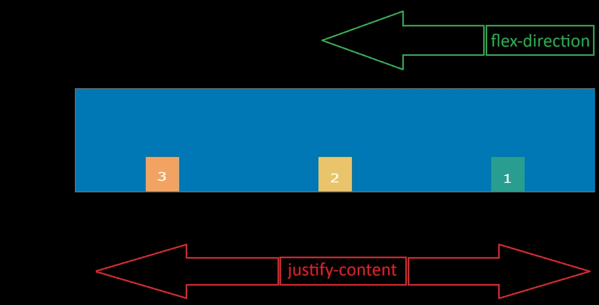
ویژگی justify-content موقعیت یا محل قرارگیری آیتم ها (فرزندان) را به صورت خطی در جهتی که قبلا توسط flex-direction انتخاب شده بود، مشخص می کند .
ویژگی justify-content دارای مقادیر (values) زیر می باشد
- حالت پیش فرض flex-start
- flex-end
- center
- space-between
- space-around
flex-start
flex-start حالت پیش فرض یا default می باشد و آیتم ها را به صورت خطی از ابتدای ظرف فلکس در جهت flex-direction مشابه شکل زیر تراز می کند.
.container { display: flex; justify-content: flex-start; }دستور مربوط به ظرف فلکس بالا در زیر به صورت کامل آورده شده است:
<!DOCTYPE html><html dir="rtl" lang="fa-IR"><head> <meta charset="UTF-8"> <meta name="viewport" content="width=device-width, initial-scale=1.0"> <title>flex</title> <style> .container { display: flex; flex-wrap: wrap; justify-content: flex-start; border: 2px solid #6b9080; } .box { padding: 15px; font-size: 15px; } .box-1 { background-color: #184e77; } .box-2 { background-color: #1e6091; } .box-3 { background-color: #1a759f; } .box-4 { background-color: #168aad; } </style></head><body> <div class="container"> <div class="box box-1"> 1 </div> <div class="box box-2"> 2 </div> <div class="box box-3"> 3 </div> <div class="box box-4"> 4 </div> </div></body></html>flex-end
flex-end آیتم ها را به صورت خطی در انتهای ظرف فلکس در جهت flex-direction مشابه شکل زیر تراز می کند.
.container { display: flex; justify-content: flex-end; }دستور مربوط به ظرف فلکس بالا در زیر به صورت کامل آورده شده است:
<!DOCTYPE html><html dir="rtl" lang="fa-IR"><head> <meta charset="UTF-8"> <meta name="viewport" content="width=device-width, initial-scale=1.0"> <title>flex</title> <style> .container { display: flex; flex-wrap: wrap; justify-content: flex-end; border: 2px solid #6b9080; } .box { padding: 15px; font-size: 15px; } .box-1 { background-color: #184e77; } .box-2 { background-color: #1e6091; } .box-3 { background-color: #1a759f; } .box-4 { background-color: #168aad; } </style></head><body> <div class="container"> <div class="box box-1"> 1 </div> <div class="box box-2"> 2 </div> <div class="box box-3"> 3 </div> <div class="box box-4"> 4 </div> </div></body></html>center
center آیتم ها را به صورت خطی در وسط ظرف فلکس در جهت flex-direction مشابه شکل زیر تراز می کند.
.container { display: flex; justify-content: center; }دستور مربوط به ظرف فلکس بالا در زیر به صورت کامل آورده شده است:
<!DOCTYPE html><html dir="rtl" lang="fa-IR"><head> <meta charset="UTF-8"> <meta name="viewport" content="width=device-width, initial-scale=1.0"> <title>flex</title> <style> .container { display: flex; flex-wrap: wrap; justify-content: center; border: 2px solid #6b9080; } .box { padding: 15px; font-size: 15px; } .box-1 { background-color: #184e77; } .box-2 { background-color: #1e6091; } .box-3 { background-color: #1a759f; } .box-4 { background-color: #168aad; } </style></head><body> <div class="container"> <div class="box box-1"> 1 </div> <div class="box box-2"> 2 </div> <div class="box box-3"> 3 </div> <div class="box box-4"> 4 </div> </div></body></html>space-between
space-between مطابق شکل زیر آیتم ها را در یک خط با فاصله برابر در جهت flex-direction قرار می دهد، به طوری که بین آیتم اول و آخر با ظرف فلکس فاصله ای وجود ندارد.
.container { display: flex; justify-content: space-between ; }دستور مربوط به ظرف فلکس بالا در زیر به صورت کامل آورده شده است:
<!DOCTYPE html><html dir="rtl" lang="fa-IR"><head> <meta charset="UTF-8"> <meta name="viewport" content="width=device-width, initial-scale=1.0"> <title>flex</title> <style> .container { display: flex; flex-wrap: wrap; justify-content: space-between; border: 2px solid #6b9080; } .box { padding: 15px; font-size: 15px; } .box-1 { background-color: #184e77; } .box-2 { background-color: #1e6091; } .box-3 { background-color: #1a759f; } .box-4 { background-color: #168aad; } </style></head><body> <div class="container"> <div class="box box-1"> 1 </div> <div class="box box-2"> 2 </div> <div class="box box-3"> 3 </div> <div class="box box-4"> 4 </div> </div></body></html>space-around
space-around مطابق شکل زیر آیتم ها را در یک خط با فاصله برابر در جهت flex-direction قرار می دهد، به طوری که بین آیتم اول و آخر با ظرف فلکس نیز این فاصله وجود دارد .
.container { display: flex; justify-content: space-around ; }دستور مربوط به ظرف فلکس بالا در زیر به صورت کامل آورده شده است:
<!DOCTYPE html><html dir="rtl" lang="fa-IR"><head> <meta charset="UTF-8"> <meta name="viewport" content="width=device-width, initial-scale=1.0"> <title>flex</title> <style> .container { display: flex; flex-wrap: wrap; justify-content: space-around; border: 2px solid #6b9080; } .box { padding: 15px; font-size: 15px; } .box-1 { background-color: #184e77; } .box-2 { background-color: #1e6091; } .box-3 { background-color: #1a759f; } .box-4 { background-color: #168aad; } </style></head><body> <div class="container"> <div class="box box-1"> 1 </div> <div class="box box-2"> 2 </div> <div class="box box-3"> 3 </div> <div class="box box-4"> 4 </div> </div></body></html>