ویژگی align-content در فلکس باکس
ویژگی align-content
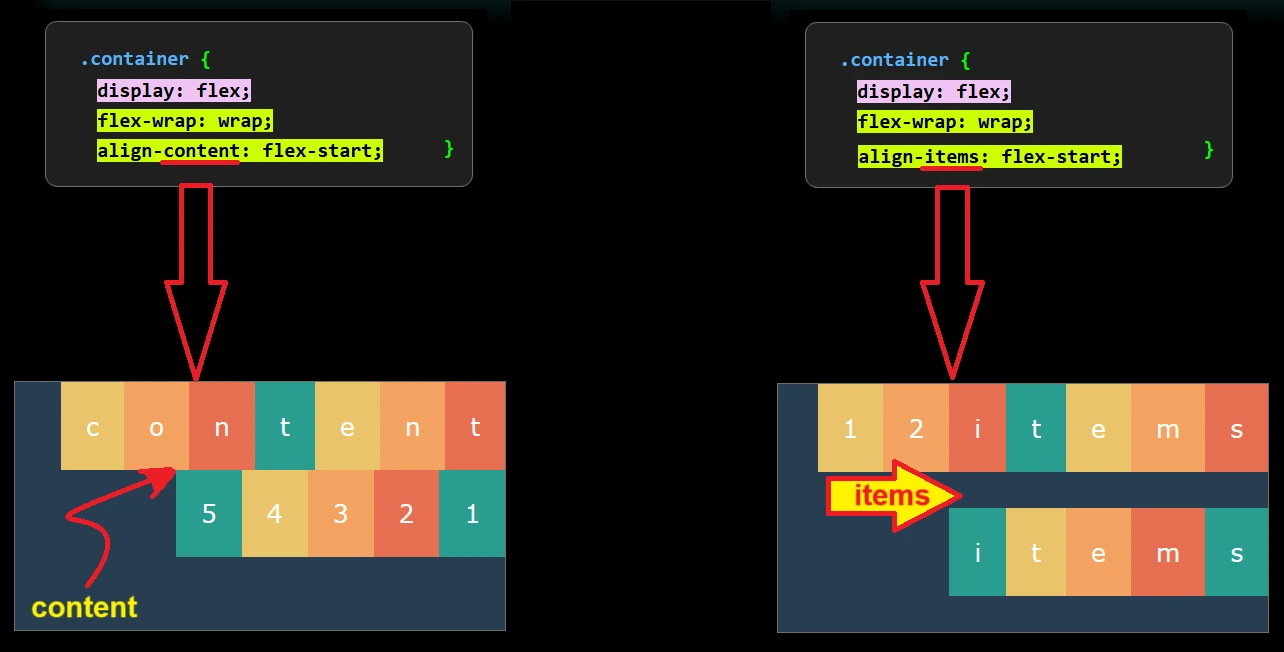
ویژگی align-content همواره با ویژگی flex-wrap استفاده می گردد و باعث می شود آیتم ها بعد از شکستن بدون فاصله به آیتم های قبلی بچسبد.
در واقع ویژگی align-content مشابه ویژگی align-items می باشد با این تفاوت که در align-items آیتم های شکسته شده با فاصله از آیتم های قبلی قرار می گیرند ولی در align-content آیتم های شکسته شده بدون فاصله به آیتم های قبلی چسبیده و یک محتوای جدید (content) ایجاد می کنند، شکل زیر را ببینید.
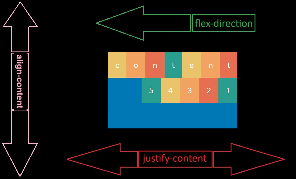
بنابراین در یک ظرف فلکس می توانید اگر تعداد آیتم ها زیاد بود، با ویژگی align-content کل محتوا (content) را در راستای عمود بر justify-content مانند align-items مشابه شکل زیر تراز کنید
ویژگی align-content دارای مقادیر (values) زیر می باشد
- مقدار پیش فرض stretch
- flex-start
- baseline
- flex-end
- center
- space-between
- space-around
مقدار stretch برای ویژگی align-content
stretch که مقدار پیش فرض برای ویژگی align-content می باشد، مشابه شکل زیر باعث کشیدگی آیتم ها از ابتدا و انتهای ظرف تا خط وسط ظرف فلکس خواهد شد.
.container { display: flex; align-content: stretch; }دستور مربوط به ظرف فلکس بالا در زیر به صورت کامل آورده شده است:
<!DOCTYPE html><html dir="rtl" lang="fa-IR"><head> <meta charset="UTF-8"> <meta name="viewport" content="width=device-width, initial-scale=1.0"> <title>flex</title> <style> .container { display: flex; flex-wrap: wrap; align-content: stretch; border: 2px solid #6b9080; margin: 1% 20%; height: 300px; } .box { padding: 15px; font-size: 15px; } .box-1 { background-color: #184e77; } .box-2 { background-color: #1e6091; } .box-3 { background-color: #1a759f; } .box-4 { background-color: #168aad; } .box-5 { background-color: #34a0a4; } .box-6 { background-color: #52b69a; } .box-7 { background-color: #76c893; } .box-8 { background-color: #99d98c; } .box-9 { background-color: #184e77; } .box-10 { background-color: #1e6091; } .box-11 { background-color: #1a759f; } .box-12 { background-color: #168aad; } } </style></head><body> <div class="container"> <div class="box box-1"> 1 </div> <div class="box box-2"> 2 </div> <div class="box box-3"> 3 </div> <div class="box box-4"> 4 </div> <div class="box box-5"> 5 </div> <div class="box box-6"> 6 </div> <div class="box box-7"> 7 </div> <div class="box box-8"> 8 </div> <div class="box box-9"> 9 </div> <div class="box box-10"> 10 </div> <div class="box box-11"> 11 </div> <div class="box box-12"> 12 </div></body></html>مقدار flex-start برای ویژگی align-content
flex-start در واقع خط شروع ظرف در جهت align-content می باشد، در این حالت همه آیتم ها به خط شروع ظرف فلکس وصل می شوند.
.container { display: flex; align-content: flex-start; }دستور مربوط به ظرف فلکس بالا در زیر به صورت کامل آورده شده است:
<!DOCTYPE html><html dir="rtl" lang="fa-IR"><head> <meta charset="UTF-8"> <meta name="viewport" content="width=device-width, initial-scale=1.0"> <title>flex</title> <style> .container { display: flex; flex-wrap: wrap; align-content: flex-start; border: 2px solid #6b9080; margin: 1% 25%; height: 200px; } .box { padding: 15px; font-size: 15px; } .box-1 { background-color: #184e77; } .box-2 { background-color: #1e6091; } .box-3 { background-color: #1a759f; } .box-4 { background-color: #168aad; } .box-5 { background-color: #34a0a4; } .box-6 { background-color: #52b69a; } .box-7 { background-color: #76c893; } .box-8 { background-color: #99d98c; } .box-9 { background-color: #184e77; } .box-10 { background-color: #1e6091; } .box-11 { background-color: #1a759f; } .box-12 { background-color: #168aad; } } </style></head><body> <div class="container"> <div class="box box-1"> 1 </div> <div class="box box-2"> 2 </div> <div class="box box-3"> 3 </div> <div class="box box-4"> 4 </div> <div class="box box-5"> 5 </div> <div class="box box-6"> 6 </div> <div class="box box-7"> 7 </div> <div class="box box-8"> 8 </div> <div class="box box-9"> 9 </div> <div class="box box-10"> 10 </div> <div class="box box-11"> 11 </div> <div class="box box-12"> 12 </div></body></html>مقدار flex-end برای ویژگی align-content
flex-end در واقع خط پایان ظرف در جهت align-content می باشد، در این حالت همه آیتم ها به خط پایان ظرف فلکس وصل می شوند.
.container { display: flex; align-content: flex-end; }دستور مربوط به ظرف فلکس بالا در زیر به صورت کامل آورده شده است:
<!DOCTYPE html><html dir="rtl" lang="fa-IR"><head> <meta charset="UTF-8"> <meta name="viewport" content="width=device-width, initial-scale=1.0"> <title>flex</title> <style> .container { display: flex; flex-wrap: wrap; align-content: flex-end; border: 2px solid #6b9080; margin: 1% 25%; height: 200px; } .box { padding: 15px; font-size: 15px; } .box-1 { background-color: #184e77; } .box-2 { background-color: #1e6091; } .box-3 { background-color: #1a759f; } .box-4 { background-color: #168aad; } .box-5 { background-color: #34a0a4; } .box-6 { background-color: #52b69a; } .box-7 { background-color: #76c893; } .box-8 { background-color: #99d98c; } .box-9 { background-color: #184e77; } .box-10 { background-color: #1e6091; } .box-11 { background-color: #1a759f; } .box-12 { background-color: #168aad; } } </style></head><body> <div class="container"> <div class="box box-1"> 1 </div> <div class="box box-2"> 2 </div> <div class="box box-3"> 3 </div> <div class="box box-4"> 4 </div> <div class="box box-5"> 5 </div> <div class="box box-6"> 6 </div> <div class="box box-7"> 7 </div> <div class="box box-8"> 8 </div> <div class="box box-9"> 9 </div> <div class="box box-10"> 10 </div> <div class="box box-11"> 11 </div> <div class="box box-12"> 12 </div></body></html>مقدار center برای ویژگی align-content
مقدار center برای ویژگی align content باعث می شود که محتوا (content) در راستای alighn content وسط ظرف فلکس قرار بگیرد.
.container { display: flex; align-content: center; }دستور مربوط به ظرف فلکس بالا در زیر به صورت کامل آورده شده است:
<!DOCTYPE html><html dir="rtl" lang="fa-IR"><head> <meta charset="UTF-8"> <meta name="viewport" content="width=device-width, initial-scale=1.0"> <title>flex</title> <style> .container { display: flex; flex-wrap: wrap; align-content: center; border: 2px solid #6b9080; margin: 1% 25%; height: 200px; } .box { padding: 15px; font-size: 15px; } .box-1 { background-color: #184e77; } .box-2 { background-color: #1e6091; } .box-3 { background-color: #1a759f; } .box-4 { background-color: #168aad; } .box-5 { background-color: #34a0a4; } .box-6 { background-color: #52b69a; } .box-7 { background-color: #76c893; } .box-8 { background-color: #99d98c; } .box-9 { background-color: #184e77; } .box-10 { background-color: #1e6091; } .box-11 { background-color: #1a759f; } .box-12 { background-color: #168aad; } } </style></head><body> <div class="container"> <div class="box box-1"> 1 </div> <div class="box box-2"> 2 </div> <div class="box box-3"> 3 </div> <div class="box box-4"> 4 </div> <div class="box box-5"> 5 </div> <div class="box box-6"> 6 </div> <div class="box box-7"> 7 </div> <div class="box box-8"> 8 </div> <div class="box box-9"> 9 </div> <div class="box box-10"> 10 </div> <div class="box box-11"> 11 </div> <div class="box box-12"> 12 </div></body></html>مقدار space-between برای ویژگی align-content
مقدار space-between برای ویژگی align-content باعث می شود بین آیتم های شکسته شده و آیتم های قبلی یک فضای خالی ایجاد گردد و محتوا (content) به خط شروع و پایان ظرف بچسبد
.container { display: flex; align-content: space-between; }دستور مربوط به ظرف فلکس بالا در زیر به صورت کامل آورده شده است:
<!DOCTYPE html><html dir="rtl" lang="fa-IR"><head> <meta charset="UTF-8"> <meta name="viewport" content="width=device-width, initial-scale=1.0"> <title>flex</title> <style> .container-12740 { display: flex; flex-wrap: wrap; align-content: space-between; border: 2px solid #6b9080; margin: 1% 26%; height: 300px; } .box28 { padding: 15px; font-size: 15px; } .box-1 { background-color: #184e77; } .box-2 { background-color: #1e6091; } .box-3 { background-color: #1a759f; } .box-4 { background-color: #168aad; } .box-5 { background-color: #34a0a4; } .box-6 { background-color: #52b69a; } .box-7 { background-color: #76c893; } .box-8 { background-color: #99d98c; } .box-9 { background-color: #184e77; } .box-10 { background-color: #1e6091; } .box-11 { background-color: #1a759f; } .box-12 { background-color: #168aad; } } </style></head><body> <div class="container-12740"> <div class="box28 box-1"> 1 </div> <div class="box28 box-2"> 2 </div> <div class="box28 box-3"> 3 </div> <div class="box28 box-4"> 4 </div> <div class="box28 box-5"> 5 </div> <div class="box28 box-6"> 6 </div> <div class="box28 box-7"> 7 </div> <div class="box28 box-8"> 8 </div> <div class="box28 box-9"> 9 </div> <div class="box28 box-10"> 10 </div> <div class="box28 box-11"> 11 </div> <div class="box28 box-12"> 12 </div></body></html>مقدار space-around برای ویژگی align-content
مقدار space-around برای ویژگی align-content باعث می شود بین آیتم های شکسته شده و آیتم های قبلی یک فضای خالی ایجاد گردد و بین محتوا (content) با خط شروع و پایان ظرف نیز یک فضای خالی ایجاد گردد.
.container { display: flex; align-content: space-around; }دستور مربوط به ظرف فلکس بالا در زیر به صورت کامل آورده شده است:
<!DOCTYPE html><html dir="rtl" lang="fa-IR"><head> <meta charset="UTF-8"> <meta name="viewport" content="width=device-width, initial-scale=1.0"> <title>flex</title> <style> .container { display: flex; flex-wrap: wrap; align-content: space-around; border: 2px solid #6b9080; margin: 1% 26%; height: 200px; } .box { padding: 15px; font-size: 15px; } .box-1 { background-color: #184e77; } .box-2 { background-color: #1e6091; } .box-3 { background-color: #1a759f; } .box-4 { background-color: #168aad; } .box-5 { background-color: #34a0a4; } .box-6 { background-color: #52b69a; } .box-7 { background-color: #76c893; } .box-8 { background-color: #99d98c; } .box-9 { background-color: #184e77; } .box-10 { background-color: #1e6091; } .box-11 { background-color: #1a759f; } .box-12 { background-color: #168aad; } } </style></head><body> <div class="container"> <div class="box box-1"> 1 </div> <div class="box box-2"> 2 </div> <div class="box box-3"> 3 </div> <div class="box box-4"> 4 </div> <div class="box box-5"> 5 </div> <div class="box box-6"> 6 </div> <div class="box box-7"> 7 </div> <div class="box box-8"> 8 </div> <div class="box box-9"> 9 </div> <div class="box box-10"> 10 </div> <div class="box box-11"> 11 </div> <div class="box box-12"> 12 </div></body></html>space-evenly برای ویژگی align-content
مقدار space-evenly برای ویژگی align-content باعث ایجاد یک فضای خالی بین خط شروع ظرف و آیتم های شکسته شده و خط پایان ظرف می گردد.
.container { display: flex; align-content: space-around; }دستور مربوط به ظرف فلکس بالا در زیر به صورت کامل آورده شده است:
<!DOCTYPE html><html dir="rtl" lang="fa-IR"><head> <meta charset="UTF-8"> <meta name="viewport" content="width=device-width, initial-scale=1.0"> <title>flex</title> <style> .container-1276 { display: flex; flex-wrap: wrap; align-content: space-evenly; border: 2px solid #6b9080; margin: 1% 26%; height: 300px; } .box28 { padding: 15px; font-size: 15px; } .box-1 { background-color: #184e77; } .box-2 { background-color: #1e6091; } .box-3 { background-color: #1a759f; } .box-4 { background-color: #168aad; } .box-5 { background-color: #34a0a4; } .box-6 { background-color: #52b69a; } .box-7 { background-color: #76c893; } .box-8 { background-color: #99d98c; } .box-9 { background-color: #184e77; } .box-10 { background-color: #1e6091; } .box-11 { background-color: #1a759f; } .box-12 { background-color: #168aad; } } </style></head><body> <div class="container-1276"> <div class="box28 box-1"> 1 </div> <div class="box28 box-2"> 2 </div> <div class="box28 box-3"> 3 </div> <div class="box28 box-4"> 4 </div> <div class="box28 box-5"> 5 </div> <div class="box28 box-6"> 6 </div> <div class="box28 box-7"> 7 </div> <div class="box28 box-8"> 8 </div> <div class="box28 box-9"> 9 </div> <div class="box28 box-10"> 10 </div> <div class="box28 box-11"> 11 </div> <div class="box28 box-12"> 12 </div></body></html>